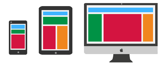
The idea behind responsive design is basically to provide one design for all possible output devices, meaning desktops, smartphones, tablets (screen sizes and resolutions). An important point to be considered is also the accessibility by all kinds of input mechanisms like mouse, keyboard, touch, etc.
A lot has been written about responsive web design in the past months. There are a lot of good articles out there on the internet and books on all kinds of interesting topics regarding this topic. The following post is a collection of what I think are the “Best Practices” in late 2012.
Browser- vs Feature-Detection
I won’t talk about this topic much. Back in the days where there was only Internet Explorer and Netscape Navigator, and where javascript was still suspicious, it was all about browser detection. The browser vendors didn’t care much about standards and pushed their own features. Browser detection was the only way to provide similar looks and behavior. But since the success of javascript, jQuery and modernizr, browser-detection has become obsolete. The only situation where it is still an issue is for the vendor-specific prefixes for non standard css properties. Well this is a topic on its own and right now it’s quiet messy and hard to keep track of. For a good reference on what you can use in what browser, visit caniuse.com. For more information on detection methods and newer concepts including something called “Form Factor Detection”, read this article on html5rocks.
Screen Sizes & Flexible Layout
The most important thing to know about responsive web design is of course flexible layout. That means your content always fits your browser / window. So first of all set your viewport width to the available screen width and prevent zoom:
<meta name="viewport" content="width=device-width, initial-scale=1, maximum-scale=1, user-scalable=no" />
Organize your content
The key points you have to keep in mind when setting up your layout:
- What is important in what situation (Some content may be more important when using mobile e.g. location based information) Reduce your navigation to the essential.
- Make priorities. You can’t show as much content on a small screen as on a desktop. Stick with whats important. Drop the rest.
Grid Layout & Media Queries
Once you’ve organised your content use media-queries to set up the layout for the different screen sizes. Media Queries are used to change the layout (actually all CSS properties) based on certain conditions. In most cases you want to check for screen sizes. You find the most common sizes to consider on css-tricks.
Basic usage:
@media only screen and (max-width : 320px) {
   /* Styles for screen-widths equal to or less than 320px */
}
The most important properities to use with media-queries are “width”, “display: none”, “margin”, “padding” and “font-size”.
Screen Resolutions
Since Apple introduced the retina (>220ppi) displays there has been a competition by hardware manufacturers on increasing the amount of pixels per inch. With the Nexus 10 Samsung just introduced a tablet with 300ppi screen-resolution, which is print quality. As this process is not going to stop in the near future, we realize that we have to come up with new concepts to deal with this development. My first approach was to use media-queries and the device-pixel-ratio property. But with further research, I realised that this would turn into endless journey as more and more hardware variations are released.

Another pretty obvious solution seems to be using Vector Graphics, as they are scalable and don’t depend on pixels. This option is suitable for simple graphics like illustrations and icons only; It won’t work on more complex images like photographs, but it is still my favorite solution right now. To assure cross-browser support, we have two options right now. Icon Fonts and SVG with fallback.
Icon Font

One option to face the screen resolution challenge and that has become very popular in the past years is using a custom icon font. View this great demo page by Chris Coyer. You’ll find a lot of great fonts online for free or use the following tutorials to make your own font:
UPSIDE:
- Cross browser support
- Full css styles advantages: size, color, text-shadow, etc.
DOWNSIDES
- only monochrome color
- time consuming to maintain: In order to change / add one icon you have to change whole font (and convert to all different formats for cross-browser support)
Scalable Vector Graphics
SVG is a huge topic. You can do almost everything with it. I will just focus on the very basics. For simple illustration and graphics SVG is the way to go.
EXAMPLE
This example shows the implementation of a basic preloader-animation in a <svg> tag. In a production environment you would probably prefer embedding it using css background-image.
/* Preloader Example */
.preloader {
   background-image: url(preload.svg);
}
/* Modernizr Fallback */
.no-svg .preloader {
   background-image: url(preload.gif);
}
UPSIDES
- Suitable for all screen sizes and resolutions
- Relatively small file size
- Works for animations
- It is XML Data – You can make (small) design adjustments directly from your editor or via css / javascript.
- You can embed SVG using: object, embed, iframe, as background-image, or directly inside html with a
<svg>tag.
DOWNSIDES
- Needs fallback to png/jpg/gif for ancient browsers
- Performance: Resource intense (specially for animations / complex images)
- To be honest, this solution doesn’t cover 100% of the possible configurations. For example if you’re using a high resolution (retina) screen and run an ancient browser with no SVG support on it. In this highly unlikely case you would still end up with blurry images.
Embedding Image and Video
To embed video and images in your website there are a few required behaviours: The content should resize to the viewport, have a maximum (original) size and keep the aspect ratio.
Embed Images
img {
   max-width: 100%;
   height: auto;
}
NOTE There is no way to specify the height of the images, which means, that while the page is loading, the images expand one after the other.
Embed Videos
Embedding videos needs a little bit more magic. Particularly when using iframes. The issue here is that you want to maintain the aspect-ratio of the original video and [height: auto] doesn’t seem to work. The following is based on this very useful article by Thierry Koblentz and has been around on the web for quite some time. So I’ll keep it simple. Lets start with the html5 video tag, which is pretty easy to implement:
video {
   max-width: 100%;
   height: auto;
   width: 600px; /* optional: acts as max-width */
}
For embedded videos use the following code:
.video-container {
   position: relative;
   padding-bottom: 56.25%; /* for videos with 16:9 ratio */
   padding-top: 30px;
   height: 0;
   overflow: hidden;
}

.video-container iframe,
.video-container object,
.video-container embed {
   position: absolute;
   top: 0;
   left: 0;
   width: 100%;
   height: 100%;
}
<div class="video-container">
   <iframe src="videoUrl" width="800" height="450" frameborder="0"></iframe>
</div>
If you want to restrict the maximum width just add a container div and give it a width and max-width.
Is :hover Dead?
Of course you could argue that with the increasing amount of touch devices, the use of the :hover pseudo element is getting obsolete. In my opinion we should not burry this option, as it still gives the best interaction feedback on non-touch devices. Nevertheless, what we have to consider when using hover is to always keep the touch devices in mind and only use the hover where it makes sense: To give the user the feedback that he can click a specific element. It should never be used for e.g. dropdown menus. As a golden rule you could say: Never use it to hide and show certain information (:hover in combination with display: none). There are some cases where you might want exactly this behavior. In this particular case you can also use the “.touch” detection of modernizr. It can be used e.g. to always show a certain element in mobile, which is only visible on mouseover in the desktop version. Despite the fact that it is not 100% accurate, it’s still the best option to get the job done.
text-overflow
Sometimes you don’t want content to wrap, but you want an indication that it has been cut off. In this case you can use the following:
.nowrap {
    overflow: hidden;
    white-space: nowrap;
    text-overflow: ellipsis;
}
In the following example you have dynamic content floating right and content which should not wrap.
Closing Comments
Responsive Design is a huge topic and to describe best practices a never-ending story. As more and more html5 features are released, these practices change as well. Also keep in mind what projects you’re working on and what their requirements are. You want to use different approaches when you have to support e.g. IE7 or lower. If you are lucky and can work for html5-ready browsers you might use other tools. What I didn’t mention in this post because I think it is not quite there yet is the flexbox property. This is certainly something worth keeping an eye on in the future.
Related topics
- A quick intro to flexbox from Paul Irish
- Make homescreen-shortcuts to provide easy access on touch-devices. Visit apple develpers for more information.